
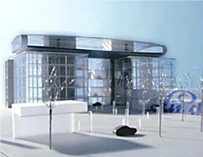
Head Office Building Linde AG
The renewing and change of the existing building structure from the 70's pursues the goal of establishing an uniform and coordinated shape with the corporate design of the Linde AG.
The key for this is the light design.
The company color blue emphasizes the solidium as a color of light, it leads the visitor and creates orientation, it marks places of different activity and is a clear indication over the brand mark Linde AG.
Disciplines
- Buildings & Architecture
Companies
Dorsch Engineers GmbH
Client
Linde AG
Location
Wiesbaden, Germany
Project Activities
- Structural engineering
Contact
Companies
